


 |
| Small handset placed on table that can be digitally connected to the kitchen to update food choices. |
 |
| Interactive table design by Microsoft. Projection screen shines onto table where movement is captured and means that you can move images on the screen around. |
 |
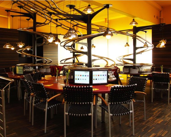
| More advanced version of the Microsoft interactive table design. Here customers can view the menu see what the food looks like and order the food on this interactive table projection. The design can also show a dining set for whilst eating. I think this is an idea I would like to replicate and develop because I think it could work well for the Yo sushi restaurant. |


|
| Strong branding with illustration creating personality |
 |
| 3D design improves the legitimacy of the brand. |
 |
| The brown card makes the design look eco friendly and handmade. The design is very minimal and still interesting. |
|
| Good clip on specials menu for a place mat or table. |
 |
| Highlighting a restaurants assets. Wooden interior takes on part of the branding and identity |


 |
| Having each range a different colour but the rest of the design the same makes the branding very strong and noticeable. |


 |
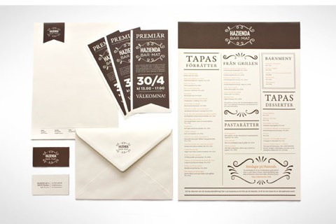
| Linking the branding to both menu's and a servers pad is a good idea, when the bill is given the servers pad can be used as a receipt and therefore ties in with the branding making it thorough and consistent. |

|
| I really love the personalised touch with the use of the wax seal. This could be used to enclose a receipt or even a tip from the customer. |
 |
| Wine menu on a wine bottle. Lovely simple idea and can be easily changed without excessive costs, |
|
| Specials menu that everyone will notice. On your plate and also acts as a cover so it doesn't get dirty. |
 |
| Lovely feminine finish on the edges of the menu page. Contrasts with the old fashioned fork illustration but works well. |
 |
| Small lunch time menu comes with the cutlery and also serves as a tie to keep everything together. |
 |
| Simple but effective finishing touches like a flower or plant in with the serviette. Could use lavender to make the serviette smell nice. |
 |
| 3D design turned into a 2D menu design adds dimension to it. |
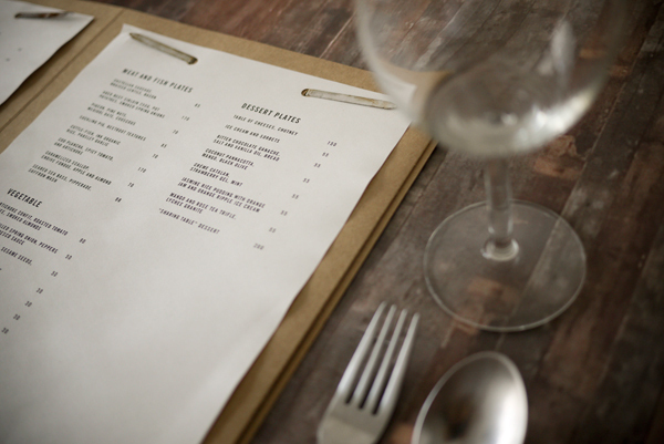 |
| Easy to change menu. Metal clasps hold the page in place and can be changed easily without large costs, |
 |
| Simple design with added class with the use of embossing. |
 |
| Beautiful foil spot varnish. Makes the menu stand out with little effort. |
 |
| Hand made individual look. Stamp will be different every time it is used. |

|
| Hand writing adds personality. |

 |
| Range of restaurant branding. Lovely homely feel. String, brown card. High end feel is created with the use of minimal design. |
 |
| Menu on paper bag. Bag is used in takeaway to contain food. People know the menu and can take it away with them for no extra cost to the company. |
|
| Simple string decoration adds to the character of the restaurant. It isn't necessarily about the type and image, little interior details can add to the branding. |
 |
| Black on white design is simple but effective. It says what it needs to say and nothing else. |

 |
| Simple touches of colour and silhouettes keep the menu easy to read but more interesting. |

 |
| Lovely leather design with simple paper menu attached. The expensive leather is kept and robust whilst the actually menu can be easily changed. |

 |
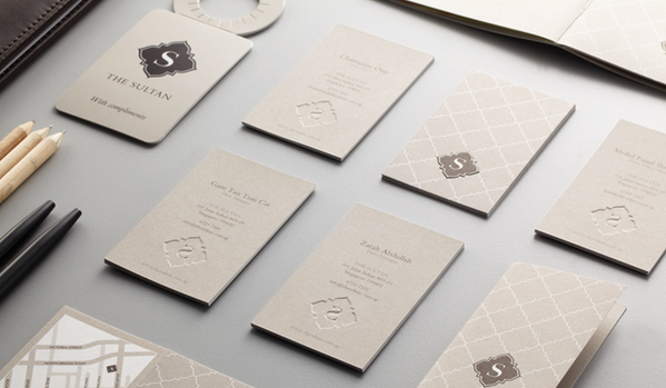
| Ranges help to make the branding strong and fluent. Everything that is used in the restaurant has been branded, This just reminds the customer at every possible point where they are dining helping with advertising. |
 |
| The idea of playing with textures on a plate could be explored further into a 'playing with your food' idea. |
 |
| This is a very personalised idea with lots of character. The different typefaces used show many personalities and a fun aspect to the brand. |
 |
| Beautiful place setting again showing off the specials menu simply toed together with string to add a rustic affect. |
 |
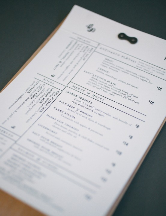
| Simple clip bord idea would be suitable for a bistro or pub lunch. The menu's can be changed over very easily but with the rustic and interesting clip boards this easily and quickly adds style to what could be a boring menu. |
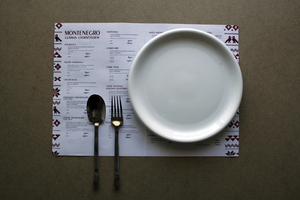 |
| Placemat and menu built into one. This is an easy way to keep the table clean and to save costs on printing separate menu's. The menu is always there and therefore customers can keep looking at it and be tempted by other items. |

|
| Because I am looking into costs for this brief. Looking at the ease of changing a menu over when a new one season starts is key. If a whole new menu has to be made because different food needs to be added to the menu then that will use up a lot of unnecessary costs. Having this simple elastic band binding means that the paper will stay secure when needed, but can also be changed over easily when a new season or menu arrives. |
 |
| Very simple and minimal design get easy added personality by the board. It creates a quick housing for the menu page whilst being quickly interchangeable. The layout is very simple and says nothing moer than it needs to, however overall it still shows a strong identity. |
 |
| Range of restaurant items transferred over into hotel design. |
 |
| I love this cute idea for a deli whose menus are ever changing. This easy and reusable method for labelling new and exciting goods works well. |
 |
| Menu stack incorporates how the menus fold into a design of their own. |
 |
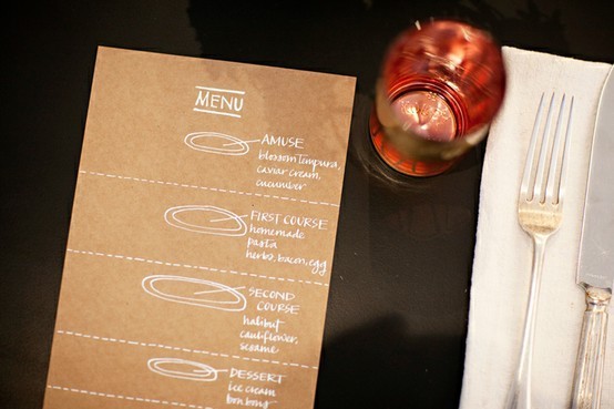
| Very structured menu is quite hard to know where to read first. If the lines were bolder or the type was altered slightly form section to section it would be more obvious and easy for the eye to flow. |
 |
| Menu card could be designed to show what you had eaten each time you have visited. Sort of like a loyalty card but more detailed, for people who like to try something new every time. |
 |
| This design could work well if integrated in to a steak house with a cow instead of a pig, showing the different cuts of meats and their flavour and tenderness. Because everything on the menu will be steak orientated the menu would simply need to be the image of the cow with type around it. |
 |
| Simple silhouette images work well to help the eye find where they want to be looking without having to read everything first. Fish, meat, salad sections are shown with the relative images. |
 |
| Light airy restaurants work well with a calligraphic typeface to link in with the femininity. Calligraphy or handwritten type should only be used for main titles or boards on a big scale so that they can be read easily. |
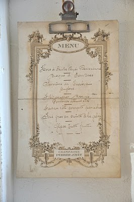 |
| I love the old style menu with the look of an old love letter. This could work well for a specials menu, a menu that is only produced on a small scale and can be handwritten or embossed, wax sealed, etc. |
 |
| Very simple and effective design. Elastic holds the paper in place. Read brown and black run throughout the design to tie it together. |
 |
| Simple illustrations inform the customer of what they will be eating. |
 |
| Outside menu helps to bring customers inside. This is the first thing they see about the restaurant to it needs to represent you in a good light. |


