Tuesday, 31 January 2012

Conceptual Packaging

For this project I am looking at the purpose of packaging and not just packaging for packagings sake. All these packaging designs below serve a purpose.  They either form part of the actual product or increase ease of use creating a double purpose. 


The lid for these spreads also acts as the knife to spread them.


This drinks container is shaped like a dumbbell and can be used as weights during exercise.


This packaging shows the contents for the shock factor. I have never seen black water before and it helps to intrigue the customer. 

This packaging is somewhat ironic. Shaped like an ice cream tub,  the contents is actually clothing to keep you warm.  The idea could also work well if there was intact ice cream inside. It could show a winter's dessert that should be eaten snuggled up with lots of cosy clothes.

The packaging becomes the serving tray.

As above the drinks bottle is shaped like a dumbbell so that it can be used as a weight during exercise. A good idea could be to fill it with protein powder and milk mix that needs to be shaken up before use. Then the user would have to do lots of weights in order for the drink to mix thoroughly and then it would be drunk after the work out. 

This packaging helps squeeze every last bit out of the tube.  It makes it easier to get the last bits out and therefore reduces waste. 

Resealable lid on drinks can helps to increase longevity of the product and makes it more user friendly.

This packaging doubles up as a coat hanger. With the garment inside the hook that once hung the item on a shelf now helps it to be hung in a wardrobe.


This packaging is very light hearted and plays on the relation of the word 'buns' with both bread and breasts.

This butter lid is quite thick and bendy and can act as a knife to spread the butter onto bread. 

This spoon device houses a powered drink/meal that can be pored into a cup and sired and eaten with the attached spoon.
This popcorn box can be put into the microwave and once the popcorn has 'popped' the packaging turns into a box for it to be eaten out of.

Bottle relates to the brand name 'Samuri' and shows the bottle as if it has been sliced by the sword.

These headphones are packaged to look like musical notes. The ear part looks like the bottom half of a note with the wire wrapped round the top to make the upper half of a note.

Honey pot comes in a box with paper bee's. This adds to the authenticity and 'fresh' value of the product. 

New packaging for Smirnoff flavoured Vodka's takes on the form of fruit peel. You have to unreel the packaging/skin to get to the product. This makes the drink seem more fresh and healthy.


Every time you take a tablet from this pack it looks like the cow has been shot.  I'm not exactly sure what the pill is for. though.

Matchstick packaging becomes interactive with the Ford truck advertisement on the side. When the matches are slid open the truck seems to extend and information and tag line are revealed.
 
This muffin packaging makes the contents look like it is an afro. It is a good way to catch the eye of new customers because it plays with your sight as to what is actually on the package and inside.

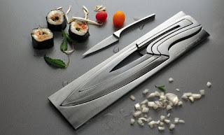
Knife in a knife in a knife...... Nice simple, space saving item, however of you lose of break a knife the set will be noticeably incomplete.

Universal packaging fits snuggly to any size or shape packaging. This is helpful to keep things well packaged and not settle about whilst being delivered.

HUGE milk twins. Twice the amount of milk however you only have to carry one bottle. Something for a big family/restaurant or really thirsty person.

Monday, 30 January 2012

Re-usable Packaging

Refillable rinks container that folds up for ease of storage when travelling.


Satchel sugar bean carry bag. Made from cotton and with all information printed onto the bag.


Chop stick case. Cute to carry with you when dining and also to keep in the kitchen. This increases the longevity of a chop stick instead of it being used once.


This packaging keeps popping up. Still love it as much as I did the first time I saw it. T-shirt comes inside the box, which then folds out to make a coat hanger for the garment.


Packaging and safety cover for children's scissors.


Packaging and safety carry case for scalpel. The packaging looks like cut offs from something you would cut out using the scalpel and makes the packaging very relevant.


Cardboard chair. Doesn't look the most comfy or stable of designs I have ever seen. But maybe you must try before you judge in this case.


Packaging is the product. Case turns into light shade. Isn't the prettiest thing and doesn't have a very good shape due to the positioning it was in whilst being packaging. Another design that I can't find is similar to this but uses cardboard instead of plastic.


Can of fish. Paper clips disguised as a can of sardines. This reusable packaging is also a very good idea for paperclips as they often scatter themselves over your desk or drawers and make a mess.


Amateur version of a similar gadget. The gadget measures spaghetti per person by passing it through a hole. This is the same idea however has been incorporated into packaging. I don't like the design of this packaging and it hash;t been made very well, however it has a concept behind it. This concept reflects the reusability of the rice packaging I am designing. It measures the amount per person for ease of use and reduction of wastage. 


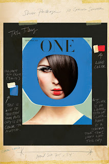
Layout/Concept Inspiration