 |
| Very simplistic logo at the side of the page gives brand strength. |
 |
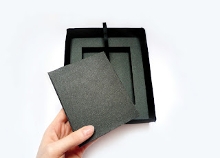
| Packaging could be nice to give a finishing touch to the book. |
 |
| hard back book seems the best option because it will make it more robust for use in an exhibition. |
 |
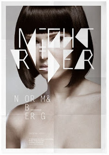
| Text overlay could work well on the documentation photography. |
 |
| For a cover broken up mix of all the image would create an abstract insight inside the book. |
 |
| Quotes dotted around the book or as title pages for the individual jewellery pieces. |
 |
| Simplistic bight end eye catching. Minimal = maximum. |
The use of handwriting gives a more personal feel the to quotes giving them more of a message to the audience.
Because the jewellery are all from different owners they have quite a jumble effect. The cover could incorporate this in its typographic design.
 |
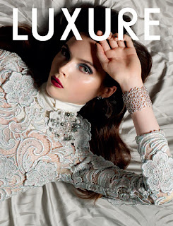
| Beautiful and elegant material for the cover will give the inside that extra bit of authenticity. |
 |
| Layout idea. Contrast between double page spreads. |
 |
| Border idea for the layout works well with type information. |


No comments:
Post a Comment