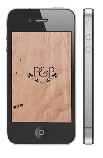
Images of the iPhone aren't that great online so I needed to made my own vector of it.
 |
| Left: Original, Right: My Vector |
I needed to find out the typfaces used on the interface for accuracy... I'm not sure how I have never taken notice of this before but the type used is simply helvetica.
 |
| Here is a mock up of a message that would be received daily on the phone. It gives a quick sum up of what the information is about. When clicked on it opens up the app to tell the audience more. |
Now I have made the initial message that prompts the customer to open the app I need to start making the designs for the actual app.
Here are some experimentations for the first page with positioning and backgrounds.
I think the same picture should be used on the front page as is used for the app icon so that the user knows they have clicked on the right app.


No comments:
Post a Comment