 |
| Standard take away design. |
 |
| Magic towels - explained at the bottom of this post. |
 |
| Shapes made from serviettes add character to them. |
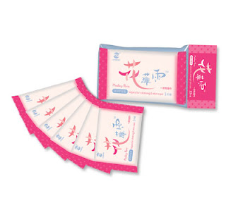
Clean, simple and fresh single serviette packets.
 |
| Simple drawing adds animation to the serviette packaging. |
 |
| Quirky bow tie idea. |
 |
| Magic towel mid-expand. |
 |
| These sachets have a nice design and feel however they look quite similar to sauce sachets and don't really break thw box of serviette packaging design. |
 |
| A message on a napkin adds personality to a redundant object. |
 |
| Branding on the serviette keep the corporate identity fluid and strong. |
 |
| Adding a message of what the serviette could be used for is interesting and thought provoking for the audience. |
 |
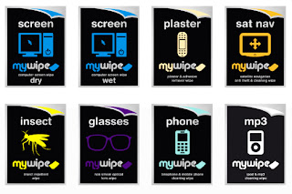
| Colourful packaging helps to create a range. |
My favourite idea is to use magic coin towels. They start about twice the size of a 2 pound coin and then you add boiling water at they rise and expand. Then you can unfold then and you have a lemony hot towel to wash your fingers after your meal.


No comments:
Post a Comment