Showing posts with label Brief 1 - Useful Packaging - DC. Show all posts

Wednesday, 16 May 2012

Brief 1 - Packaging Ideas

I like my initial idea of using a tube design to hold the rice.

The tubes could be collected together in packaging so that you get a few portions of rice per purchase.

I  really like the idea of test tubes holding the rice. They would be the perfect size and still link in with my original idea of having metal tubes holding the rice.


The tubes could be stored/packaged in this kind of device.

For a range there could be different types of rice in the tubes and spices could be added to make more of a meal, or flavoured rice.


I really like this idea of test tubes in clear acrylic.

Printing on the top information like, cook time, per person, logo,  


Thursday, 8 March 2012

Progress Tutorial - Brief Update

Brief 1 - Packaging


Brief 2 - 17


Quickly finish this just for submission.
After submission further the brief.
Think about colour and how the audience can interact with the brand.
What styles are they. Teenagers can change their style with their mood.
It is all about experience in store and how it can stand out.
This could be integrated with brief 1, looking at re-usable and conceptual packaging. How can the packaging change with the style of the customer?
Extreme styles like gothic, clubbing, glamourous, holiday, etc.
How far can I push it? - Adverts, Photoshop renders, interactivity.


Brief 3 - Fashion Yearbook


This is ongoing and has been all timetabled. We are waiting for the pictures and have received the information already. Layouts need to be made by Monday.


Brief 4 - Photography


This brief is slightly boring me, if I can't see it going anywhere or benefitting myself then drop it.


Brief 5 - Menu


The Pickle and Potter menu design app just needs to be designed now with information - think about ordering on the app.

Chaophraya takeaway menu needs to give the customer the same sort of experience at home. How can you make a gourmet takeaway? Think about every part of the experience. The menu should look into stock, finish, size, distribution, purpose (wallet/bag size). Think about bags and cutlery as well.

Yo!Sushi may be a problem. Because the brand has such a strong identity already there wouldn't be much designing required, it would just be a matter of putting the branding onto the digital interface.

So thinking of a way to 'revolutionise' another restaurants menu. The idea of the digital menu is to make to restaurant have no need for waiters. So.... to keep the idea of having a conveyor would enable to chefs to serve the food and therefore still need no waiters. Tapas comes in small portions and could also use a conveyor to be served.

I will be designing the restaurant style for a Tapas establishment. I need to do some research into what restaurant I will be choosing. I will be basically putting the Yo!Sushi idea and converting it into a Tapas style so that I can play around with the branding.


Brief 6 - Short Briefs

Brief 1 - Rice Packaging Materials And Inspiration

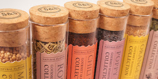
I really like the rustic feel and hand made personality.


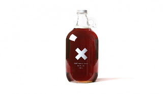
White type works well with transparent packaging.


adding patterns to the packaging that relate to the cuisine helps to make ranges for the products

String gives a feeling of handmade and care going into the process.

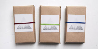
I really like the idea of white silhouettes depicting the contents. The brown card also adds to the hand made but uniform feel.  

Hand packed gives the product a mor personal look.


Handwritten type on a white background  


Brown hessian bags can cover and protect the contents.


Child like type adds personality to the packaging and brand.


Little finishing touches add to the design and make people come back for something different.


Tuesday, 31 January 2012

Conceptual Packaging

For this project I am looking at the purpose of packaging and not just packaging for packagings sake. All these packaging designs below serve a purpose.  They either form part of the actual product or increase ease of use creating a double purpose. 


The lid for these spreads also acts as the knife to spread them.


This drinks container is shaped like a dumbbell and can be used as weights during exercise.


This packaging shows the contents for the shock factor. I have never seen black water before and it helps to intrigue the customer. 

This packaging is somewhat ironic. Shaped like an ice cream tub,  the contents is actually clothing to keep you warm.  The idea could also work well if there was intact ice cream inside. It could show a winter's dessert that should be eaten snuggled up with lots of cosy clothes.

The packaging becomes the serving tray.

As above the drinks bottle is shaped like a dumbbell so that it can be used as a weight during exercise. A good idea could be to fill it with protein powder and milk mix that needs to be shaken up before use. Then the user would have to do lots of weights in order for the drink to mix thoroughly and then it would be drunk after the work out. 

This packaging helps squeeze every last bit out of the tube.  It makes it easier to get the last bits out and therefore reduces waste. 

Resealable lid on drinks can helps to increase longevity of the product and makes it more user friendly.

This packaging doubles up as a coat hanger. With the garment inside the hook that once hung the item on a shelf now helps it to be hung in a wardrobe.


This packaging is very light hearted and plays on the relation of the word 'buns' with both bread and breasts.

This butter lid is quite thick and bendy and can act as a knife to spread the butter onto bread. 

This spoon device houses a powered drink/meal that can be pored into a cup and sired and eaten with the attached spoon.
This popcorn box can be put into the microwave and once the popcorn has 'popped' the packaging turns into a box for it to be eaten out of.

Bottle relates to the brand name 'Samuri' and shows the bottle as if it has been sliced by the sword.

These headphones are packaged to look like musical notes. The ear part looks like the bottom half of a note with the wire wrapped round the top to make the upper half of a note.

Honey pot comes in a box with paper bee's. This adds to the authenticity and 'fresh' value of the product. 

New packaging for Smirnoff flavoured Vodka's takes on the form of fruit peel. You have to unreel the packaging/skin to get to the product. This makes the drink seem more fresh and healthy.


Every time you take a tablet from this pack it looks like the cow has been shot.  I'm not exactly sure what the pill is for. though.

Matchstick packaging becomes interactive with the Ford truck advertisement on the side. When the matches are slid open the truck seems to extend and information and tag line are revealed.
 
This muffin packaging makes the contents look like it is an afro. It is a good way to catch the eye of new customers because it plays with your sight as to what is actually on the package and inside.

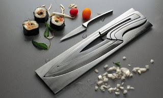
Knife in a knife in a knife...... Nice simple, space saving item, however of you lose of break a knife the set will be noticeably incomplete.

Universal packaging fits snuggly to any size or shape packaging. This is helpful to keep things well packaged and not settle about whilst being delivered.

HUGE milk twins. Twice the amount of milk however you only have to carry one bottle. Something for a big family/restaurant or really thirsty person.