The bag design was one of the most complicated parts of making the products for this brief. Like with the box designs I didn't have a net for it and therefore needed to make it up in my head.
All of the takeaway bag designs that I found weren't very inspirational and I wanted my bag to be very unique and personal to the restaurant's branding. I wanted the bag design to follow with the origami theme and so I decided to design my own net.
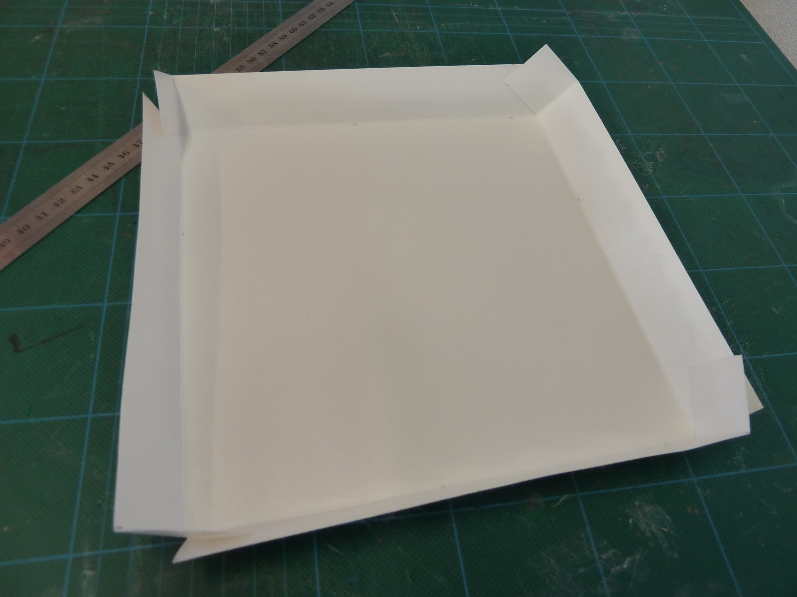
I measured the space needed to put the products inside the bag. I wanted the bag to resemble the menu shape in some way, really elongated. I decided that a fan idea would be nice on the side of the bag to fold it. Here is attempt one and two. The first attempt used laminated white card, tha same that was used for the food boxes. This proved to be too thick, so I decided to use thick cartridge paper so that the folds would bend better.
The box created too many creases on the paper and made it look very messy and unprofessional. Also because of the design sometimes the fan feature popped outside the box instead of folding inside.
My idea was to have the same handle type as I used on the box packaging so that they linked in together. So the handle is on one side and the box would be closed by a sticker and held by the strap.
The folds were still too messy on the thinner paper and the concept didn't work easily.
The reason that the design didn't work is because the net didn't enable the fans to fold correctly and therefore they made the rest of the paper creased. The lines here go straight down and stop at a horizontal crease at the lower end of the box and this stops the fan shape from being opened and closed properly.
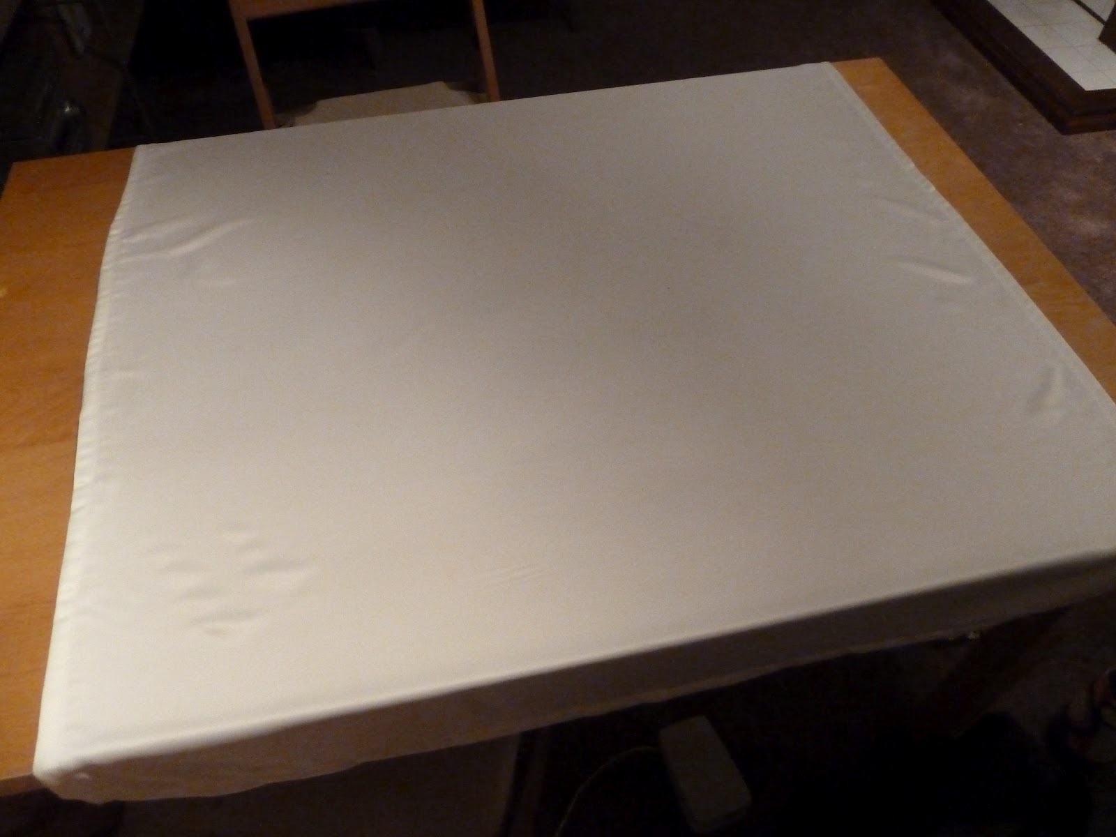
I then decided to scrap the idea of having a carry bag for the food and decided to go along a more conceptual approach. My idea was to have the carrier made from material and double up as a table cloth. The idea stemmed from the idea of a bundle:
So the food would be wrapped up in the table cloth which would act as a carrier and then when the customer got home they open the carrier and use it as a table cloth.
So I spent the majority of a night sewing and making a table cloth that I could use and then when I finished and put it all together it looked, well basically like what it was - a table cloth full of food - it just didn't work.... Back to the drawing board.
My next idea was to have an actual fan shape design on the side of the box and not have it using parallel lines. If the lines joined at a point at the bottom there would be no intersecting folds to interfere with the mechanism. The design is to work like a traditional fan.
Finally it works!