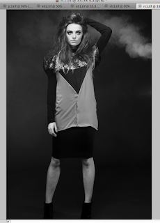
This brief was a collaboration with myself Kim Sandford, Charlotte Warren and Becky Tipping. This brief has helped me learn a lot about working for a real client and tight deadlines. This brief out of all of my FMP projects has tested my design skills and knowledge the most.
This brief needed tight time schedules, good communication skills and determination. The brief timescale that we were originally set tured out to be much less that anticipated. Originally we were to be given a couple months to collect order and layout the yearbook. Instead we ended up with 3 days where we had to organise all of our information and transform it into a respectable and working yearbook for the fashion pathway B.
Because the deadlines that the fashion teams were given by their tutor were very late in the brief this meant that we only received the vast majority of the images for each student a couple days before the book was to be sent off to print. This meant that in the meanwhile we had to make sure that the layout grid, spacing, concept, covers, page numbering and anything else that could be done without the pictures was put in place. This meant that we had a yearbook of information, but nothing to fill it. As a group we found it quite hard to decide on the layout and cover ideas because we didn't have any of the content for the book. We therefore had to pick a fairly neutral concept and colours for the design so that the images could speak for themselves and weren't overshadowed by our designs.
We designated 9-10 students per person in our group so that we were in charge of their layouts to help break it down.
Further roles were:
Kim: Front Cover, Images grid, liaison
Charlotte: Front Cover, final tweaking, typography
Becky: Breaker Spreads
Me: Contents page, page numbering, Back Cover, acknowledgements layout, quotes layout.
Working for a real client and getting the book published in its 100's meant that everything had to be perfect and this but a great strain on our group, however I feel that we rose to the challenge. I have also learnt more about setting documents up to print looking at file types, sizes and layout.
I have learnt that deadlines can be very short but if you work to your full capacity it can be done. This seemed like an impossible task, however because we knew that it HAD to be done, we made it happen. It helped to encourage me to know that I am more capable that maybe I once thought. Communication between our group was good and I think overall we worked well together and came out with a result that we are all happy of.
Showing posts with label Brief 3 - Fashion Yearbook B - DP. Show all posts
Showing posts with label Brief 3 - Fashion Yearbook B - DP. Show all posts
Monday, 4 June 2012
Tuesday, 29 May 2012
Wednesday, 16 May 2012
Brief 3 - Fashion Yearbook - Type Details
Student information layout details.
Title of the collection is in capital letters. Helvetica light size 9. The information is 2 lines down. Paragraph spacing can go over 3 columns separated in relation to where the sentences end. Generally we tried to make the top paragraph the longest and then thinner further down relatively. If the students had a work placement it would be in line with the paragraphs titled in bold. Each workplace has its own line.
Brief 3 - Fashion Yearbook - Back Cover
The back cover needs to relate to the front cover some how.
Experimentation with logo:
Final back cover design:
This design uses the angle on the front cover on with the College's logo in line with the title on the front. It is simple yet works with the theme and says everything that it needs to say.
Brief 3 - Fashion Yearbook - Contents Designs
Here are design I made for the contents page. We wanted the contents to be very easy to navigate and therefore utilise white space with a touch of colour.
It seemed most appropriate that the structure of the contents related to where the breaker spread lie in the book. Four columns of the four sections were used to create a purposeful structure.
The students work is separated form the acknowledgements and quotes to help again to define sections.
I experimented with lines slashes to relate to the cover, however I feel that the contents works better without them because it is a navigation page it needs to be as easy to read as possible.
Adding the contents title.
Here I linked the positioning and size with the titles for the acknowledgments and quotes pages.
Final Contents Page:
The final contents page is very simple and clean. With splashes of colour from the cover and inside theme. Non student pages at the beginning and the end of the book are separated from the students and here work well as a reflection effect.
Brief 3 - Fashion Yearbook - Duo Tone Breaker Spreads
For the breaker spreads we are showcasing the students that are in the following section by altering one of their images into duotone and putting it into a layout. Below is the process.
9 images across a double page spread.
9 images on each page.
Final breaker spreads:
Subscribe to:
Posts (Atom)


