
Showing posts with label Brief 4 - Photography Collaboration - DP. Show all posts
Showing posts with label Brief 4 - Photography Collaboration - DP. Show all posts
Tuesday, 29 May 2012
Tuesday, 8 May 2012
Brief 4 - Evaluation
Photography Collaboration
I decided to take this project no further than was required by Benji. I think along the way I felt that final decisions lied with Benji and sometimes it felt like it was his project and not mine as well. The project has taught me a lot about collaborations and I feel it has been a learning curve more than anything.
It has opened my eyes to the world of live clients and sometimes you have to just do the work. In this case I feel like I was at a slight loss, because I completed Benji's project for him and seemed to come out with something that I wasn't really happy to put into my portfolio at the end.
Overall I am glad that I was part of the collaboration and through out the process I have gained contacts within print and a project for my FMP.
Brief 4 - Photography Collaboration - Publicity
There was an exhibition of the work in the mosaic bar at Leeds College of Art, showcasing both the book and three chosen prints of the work.
Benji also put the work onto Behance and Facebook for ongoing publicity.


Brief 4 - Photography Collaboration - Making of The Book
We got the book printed at Hollingworth and Moss. They also do specialist binding, however it was very expensive with the book probably costing over £100 for what we wanted to achieve. We in the end decided to just get it printed there.


The first time we got the printed book back it was a bit of a mess. The printers stitched along the edge to make it easier for me to bind it, however the stitching was very messy and was visible when the book was opened. Also the pages didn't match up. Images that went over a double page spread didn't match up and it just was't done to the standard expected. Kindly it was printed again for free and this time was stapled together. This made sure that the binding was straight and that it was done to a more professional finish.
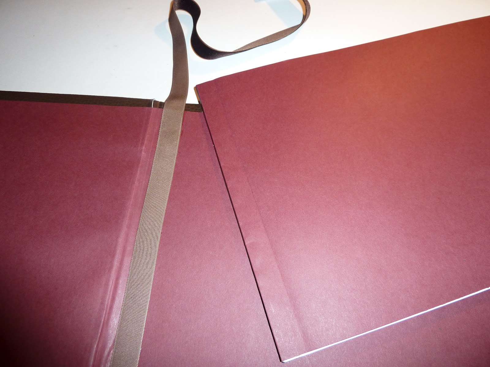
Below are images of the process that I undertook to make the cover and bind it all together.
First of all the cover was laser cut. Benji had purchased the material he wanted to use for the cover. It was a brown leatherette. It took quite a while to get the right settings on the laser to cut to the right depth.


Benji wanted the lettering on the front to be gold. I tried a few methods including gold foil, gold paint, and also silver. It was very hard to get the letters coloured in neatly. Initially Benji wanted the letters to be fully cut out, however because not they weren't there needed to be a colour to the text.
The best way I could find at this point was to use a very fine brush and colour the etters in by hand using gold paint. This was vey hard to do, and wasn't as neat as I had hoped. however Benji was impressed and satisfied with the result.


After the cover had been lasered, I cut out thick card sheets to mount the leatherette onto (front, back and spine). The front of the book also had two layers of foam in between the card and leather to add a cushion like effect.


I then wrapped the leather tightly round the board and glued into position. A burgundy coloured paper was then glued to act as an inner cover to the book. This was also chosen by Benji.


 |
| Back of the book: 'By Benjamin Turgel and Ellis Thynne' |
 |
| Spine: 'Secrets of Jewellery' |

I then mounted the book pages to some of the burgundy paper using binding tape that was given to me by the printers. This helped to hide the staples and give is a back to slot into the spine.


Brown velour ribbon, was then glued to the inner back cover to act as a book mark.


Brief 4 - Photography Collaboration - Book Problem
For some reason when the book was converted to a PDF the type face didn't work.
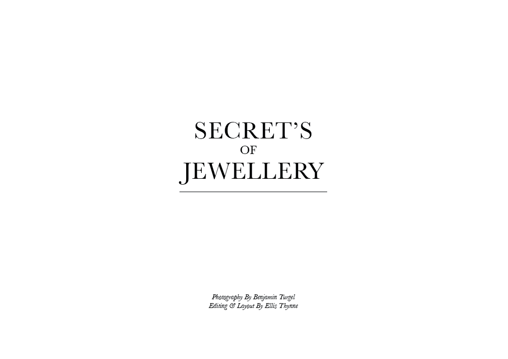
Beow are a few screen shots from the book of how it looked like.


Because this happened we had to decide on a new font that was similar to the original one we chose. We didn't want the book to look completely different and it still needed to have the same overall feel to it.
InaiMathi is the typeface that we chose to change the body copy to. The typeface is sans serif and is also very easy ro read. It is a very neutral font and therefore doesn't influence the imagery or the story being told.
Brief 4 - Photography Collaboration - Cover Ideas
Cover Typography and positioning:


Inside layout and type:


Subscribe to:
Posts (Atom)