This brief has introduced me to a different side of graphic design that I haven't previously visited. Make up design branding has to be very versatile to work across a whole range of products. It also has to stand out amongst the crowd in a very saturated market. The direction that I took with this brief was to design the branding to see a different side to make up branding as it is seen today. Make-up brands are seen as very self assured and strong, however this brief wanted to appeal to teenagers. From research it showed that teenagers adopt many different styles and as they are at a very influential stage in growing up they are experimenting and finding out hy they really are. The rebrand of 17 therefore aims to help teenagers in this transition between teens and adults, helping them to experiment freely and be accepted for being who ever they want to be - through the medium of make-up.
I feel I have learnt a lot about print finishes and packaging during this brief. I have also learnt a lot about the importance of understanding the needs of the target market. Understanding the target arket can mean the difference between your product working or flopping.
This brief also enabled me to experiment with pastel make-up on a photo shoot as part of my concept. I found the photo shoot a very enlightening experience. It taught me the importance of having a design direction and being able to direct people on set. Getting the right shot is key to making the advertisement work.
Weaknesses within this brief I feel lie within the production of the packaging and label designs. I searched for somewhere that I could get prototypes made for the packaging however there were none that would be of a suitable budget or time scale. If I were to get the prototypes made this would have made the whole brief look a lot more professional. Instead I had to make to with my own best judgement as to how the products could look most professional and me produced by myself.
Overall I am quite pleased with this brief, I feel I has answered the problem and I think it would work well in a retail environment. The branding is unique and not like anything on the market at the moment and I have learnt a lot along the process that will aid me in future projects.

Showing posts with label Brief 2 - 17 - DP. Show all posts
Showing posts with label Brief 2 - 17 - DP. Show all posts
Monday, 4 June 2012
Tuesday, 29 May 2012
Thursday, 24 May 2012
Brief 2 - 17 - Packaging Prints
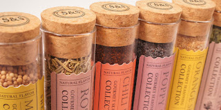
Designboard pre print:

These are the prtined packaging items. The pckaging has been painted with black board paint to give it a matte effect. The labels were printed on matte sticker paper to help give the black a deepness. Some of the edges need neatening up so that there ar no white marks, but apart from that I am quite happy with them. The branding looks like a real set that you could imagine on a shelf and I feel that It has answered the brief to attract a young audience and make them interested. The type, colours and format give the overall feel a suited and thorough design.


Thursday, 17 May 2012
Brief 2 - Photoshoot into Photoshop
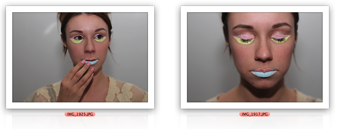
For these colour burst images I made different layers of the colours and layered them over a grayscale version of the image to make them 'pop' out.


The coloured images look more 'beauty' related with soft colours. I have brightened and upped the contrast on these photos to make the whole image a bright pastel colour.


My favourite images are the coloured ones. I think they best represent the idea of the brand that I am trying to get across. Fun, playful, individual, and still good for your skin.
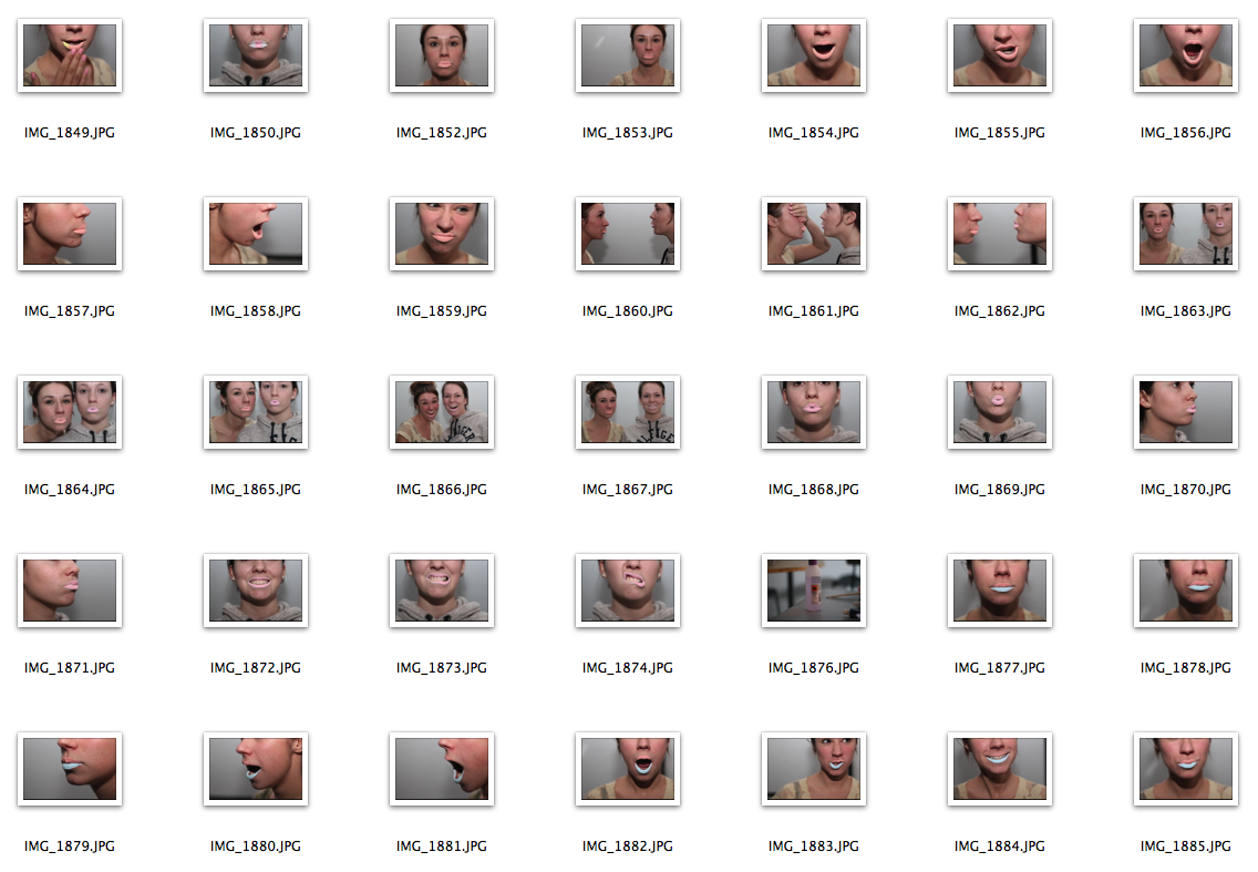
Brief 2 - Pastel Photoshoot
For use in advertisements and/or on the make up packaging I arranged a photo shoot that experimented with pastel make up colours. The colours I used match the ones used in the branding for 17.


The best selection:


The best selection:


Wednesday, 16 May 2012
Brief 1 - Packaging Ideas
I like my initial idea of using a tube design to hold the rice.
The tubes could be collected together in packaging so that you get a few portions of rice per purchase.
I really like the idea of test tubes holding the rice. They would be the perfect size and still link in with my original idea of having metal tubes holding the rice.


The tubes could be collected together in packaging so that you get a few portions of rice per purchase.
I really like the idea of test tubes holding the rice. They would be the perfect size and still link in with my original idea of having metal tubes holding the rice.


 |
| The tubes could be stored/packaged in this kind of device. |
 |
| For a range there could be different types of rice in the tubes and spices could be added to make more of a meal, or flavoured rice. |

 |
| I really like this idea of test tubes in clear acrylic. |
 |
| Printing on the top information like, cook time, per person, logo, |


Wednesday, 14 March 2012


Subscribe to:
Posts (Atom)