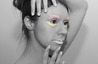
For these colour burst images I made different layers of the colours and layered them over a grayscale version of the image to make them 'pop' out.
The coloured images look more 'beauty' related with soft colours. I have brightened and upped the contrast on these photos to make the whole image a bright pastel colour.
My favourite images are the coloured ones. I think they best represent the idea of the brand that I am trying to get across. Fun, playful, individual, and still good for your skin.


No comments:
Post a Comment