This brief is initially a short concept driven brief to design and submit board of designs for the graphic design yearbook.
This is a collaborative brief and I will be working with Charlotte Warren, Liz Ibbotson and Becky Tipping.
Below is some research taken into existing Yearbooks produced for this College and also research into print finishes layout style and size.
 |
| Pages randomly placed inside break up the long seems of photos and give an insight into course leaders and students thought about the course. |
 |
| Individual students pages show pictures of them doing something that represents them. For example holding something relevant like a skateboard maybe. This makes the pages more personal and helps people to understand better the designer and their work. |
 |
| Layouts include a range of picture and type ratios. This example is image heavy. I think this would be the best idea as the purpose of the yearbook is to showcase peoples designs and finished works. |
 |
| The front cover shows the name of the course the college name and all the names of the students that feature inside the book. It is a very simple concept, however I feel it lacks much thought and consideration. It is very straight forwards and could push creativity a bit more. |
 |
| The type running vertically makes you turn the page and view the students designs from every angle. |
 |
| Bold red colour on certain pages helps the break the book into sections and give further information about the course, students and tutors. I really like the way the type flows in different directions, it makes the book more interactive for the reader. |
 |
| Different coloured backgrounds give the pages a different feel and show the work in a different light. |
 |
| Beautiful layout links type and image together in a double page spread. The blacks in the border of the image flow to the typography. |
 |
| Embossing and UV varnish make a beautiful and subtle print finish. It helps the design to capture the light and makes you want to pick it up to see how it feels. |
 |
| I really like the way the text flows form line to line, it really makes the eye work hard. There isn't loads to look at, but because the lines are broken and rotated it doesn't give the eye a natural way to flow around the page so it makes you work it out for yourself. |
 |
| I really love it when binding, the treads are let uncut. I think it gives the design a really hands on and thought through feel. It also adds more aesthetic appeal. |
 |
| This front cover shows a lot of expression and movement. It really provokes the creative juices. |
 |
| UV spot varnish adds an extra feel of luxury and depth to colour on a page. I think it looks amazing varnishing or foiling clear on block, it really adds depth and ink is unnecessary. |
 |
| Foiling comes in a wide array of colours. For the front cover certain lettering could be picked out to make it stand out on the page. This can help to strengthen the message of change the hierarchy. |
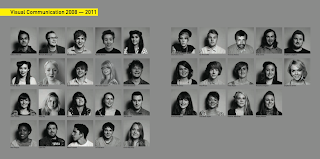 |
| Showing all the faces of the class is a great idea. It could be nice to have pictures of when we first started next to ones of when we have finished to show how we have grown (aged). |
 |
| Contact information at the back of the book sums up the course and makes it accessible to anyone reading it. |
 |
| It is interesting to have a short paragraph written by each student on their personal page to give a small insight into how different people have adapted the course to their individual needs and aspirations. |
 |
| I really love the consideration of white space on a page. The white space can be a thought provoking as where the content is. The white space can totally change the feel and appearance of a page and how you interpret it. |
 |
| Making each students individual page have a loose grid but changing the layout from page to page so that it is still interesting to look at is key to make the audience read on. |
 |
| How will each person's name be presented? Will it over power the image of will the image over power the type? |
 |
| Diverse text on the front. The cover gives a good ides of what is on the inside. |
 |
| Having the students work explained by them gives you an insight into how their minds work. |
 |
| Images of students 'mid creative flow' shows the design studios in use. |
 |
| Front and back cover joining together to create one panoramic image. |
 |
| Tight grids and margins. |
 |
| Choosing the right font is key. Changing the font of a book can make it look and feel completely different and ultimately change its meaning. |
 |
| Linking the front cover design to the inside is important for a thorough design. The shape UV varnished on the cover follows through to the speech bubble of the students inside. This idea could be adapted into colours, shapes, print finishes, sizes etc. |
 |
| This design is one of the less visually appealing that I have found. The black lines make the page look cramped and the type face for the students names is too bold and overcrowds the rest of the page. The body copy is very randomly distributed into columns, making one column the same length of the picture adjacent and the other column randomly a few lines longer. The image at the bottom also seems to have been shoved as low down as possible leaving an odd sized gap between the body copy and the image. I think the person who has designed this has tried quite hard with this design however they have ignored nearly all of the fundamental rules of type and layout. |
The five below images are from the same Graphic Design yearbook. They show a well rounded and thought through design. Each page incorporates colours from the front page and layouts are simple, yet versatile. Each student has a space to disclose information about their practice, work experience, contact information and anything else necessary.
 |
Finally a small after thought. Maybe the book could be of two halves? What could the halves be?... Type/illustration, Girl/boy, Quotes/design work etc.
I just think it could be a nice idea, if I could think of the categorisation, to have a two sided book. It would make for a unique design and a more interactive one to read. |


No comments:
Post a Comment