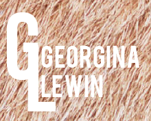
Initially I started by playing around with hand drawn letter 'G's to see how I would possibly be able to express Georgina through her branding.
I felt that the hand drawn type wouldn't work that well because it would show my personality rather than hers. She said when I initially met her that she wanted the design to look modern and minimal, so I started to look at existing fonts that would have more structure.
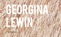
I then started to play around with my idea of using materials for the background to see how it would look. The typeface I chose was Bebas. It has an elegant, yet strong feel to it that I think will work well with Georgina's final outfits. I wanted to stick to simple colours for the typeface so that it would increase its versatility when placed on different backgrounds.
I played around with positioning, size, and opacities.
The main concept is to focus in on main aspects of Georgina's work to help emphasise what she is all about.
I thought the design needed something more to it, so I started playing around with letterforms and how they can create patterns. Georgina works a lot with patterns so this would relate back to her personally.
The design needed to be quite abstract, but at the same time be readable as initials.
Playing around with lines to separate the text gave the design a different feel. Below is my first final idea. I will see what Georgina thinks of this design and concept and then see where to progress from here.


No comments:
Post a Comment