
I wanted the designs to say as much as possible with as little text as possible, so simplicity was key.
For the labels on the sauce they were circular to fit the lid. Each item was simply labelled with its contents or function.


 |
| Purple foiling gives the design a luxury feeling and helps to catch the light. |


 |
| The towel has instructions printed on the back so the customers know how to use it. |

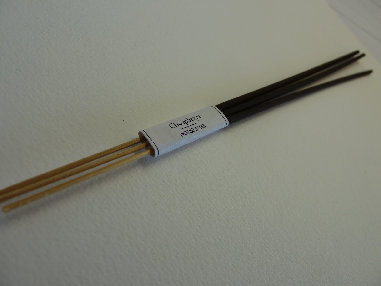 |
| The incense sticks are simply packaged with a strip of paper like the towel. |
The white background worked better than the purple background as it was easier to read.


The chopsticks are very thin and needed a lot of preparations and tests to make sure that the logo was placed in exactly the right position. I tested out placement and sizes on a piece of mount board on the laser cutter. I used the laser cutter because it creates a nice natural brown burnt colour that matches the natural wood and bamboo materials.


The idea for the plate was very similar to the chopsticks. A simple logo in the middle of the plate. I experimented with size and positing, however the plate below had the best result.

No comments:
Post a Comment