

The name Oracle suggests wisdom and mystery.
The building is round.
The interior is very clean with a lot of white and light woods.
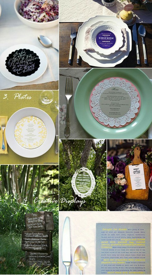
These three images below sum up what I would like the menu to look like.
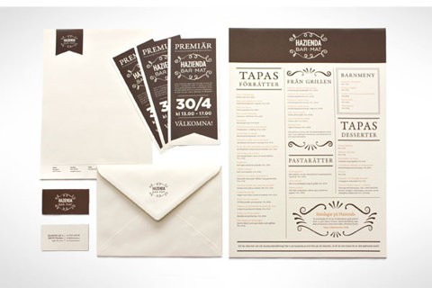
Interesting binding technique using string, elastic or ribbon. Brown card against white thick paper.
Splash of colour.
Writing about food in handwriting.


The River Plate -

The menu needs to reflect the atmosphere in the restaurant and therefore needs to be colourful and vibrant.
I think the idea of using stamps to create a rustic and individual feel would work well here.
Offers from the menu or venue information on disks that sit on the plates when you are seated add that little something to the experience.

The New Conservatory -
The inside os very traditional and exudes class. I think a slight contrast would work well here. WIth a modern twist of minimalist design this will help to bring the restaurant up to date whilst still keeping the traditional features. Ink stamps and hand written receipts will help to keep everyones experience personal.


Viva -
I need to keep the Italian theme very strong and traditional. The restaurants needs to feel more branded and purposeful inside.

My idea is a very stylised menu, with every aspect reflecting the logo and branding. Small details are key here to make it look as authentic as possible. Small cards of special pegged to the table cloths and string to tie everything together will help to reate the overall feel and look.


No comments:
Post a Comment