 |
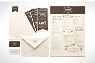
| Strong branding with illustration creating personality |
 |
| 3D design improves the legitimacy of the brand. |
 |
| The brown card makes the design look eco friendly and handmade. The design is very minimal and still interesting. |
 |
| Good clip on specials menu for a place mat or table. |
 |
| Highlighting a restaurants assets. Wooden interior takes on part of the branding and identity |
 |
| Having each range a different colour but the rest of the design the same makes the branding very strong and noticeable. |
 |
| I really love the personalised touch with the use of the wax seal. This could be used to enclose a receipt or even a tip from the customer. |
 |
| Wine menu on a wine bottle. Lovely simple idea and can be easily changed without excessive costs, |
 |
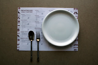
| Specials menu that everyone will notice. On your plate and also acts as a cover so it doesn't get dirty. |
 |
| Lovely feminine finish on the edges of the menu page. Contrasts with the old fashioned fork illustration but works well. |
 |
| Small lunch time menu comes with the cutlery and also serves as a tie to keep everything together. |
 |
| Simple but effective finishing touches like a flower or plant in with the serviette. Could use lavender to make the serviette smell nice. |
 |
| 3D design turned into a 2D menu design adds dimension to it. |
 |
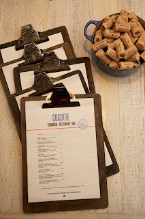
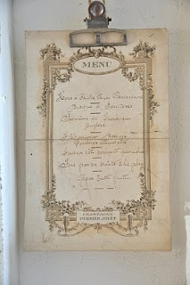
| Easy to change menu. Metal clasps hold the page in place and can be changed easily without large costs, |
 |
| Simple design with added class with the use of embossing. |
 |
| Beautiful foil spot varnish. Makes the menu stand out with little effort. |
 |
| Hand made individual look. Stamp will be different every time it is used. |
 |
| Hand writing adds personality. |
 |
| Range of restaurant branding. Lovely homely feel. String, brown card. High end feel is created with the use of minimal design. |
 |
| Menu on paper bag. Bag is used in takeaway to contain food. People know the menu and can take it away with them for no extra cost to the company. |
 |
| Simple string decoration adds to the character of the restaurant. It isn't necessarily about the type and image, little interior details can add to the branding. |
 |
| Black on white design is simple but effective. It says what it needs to say and nothing else. |
 |
| Simple touches of colour and silhouettes keep the menu easy to read but more interesting. |
 |
| Lovely leather design with simple paper menu attached. The expensive leather is kept and robust whilst the actually menu can be easily changed. |
 |
| The idea of playing with textures on a plate could be explored further into a 'playing with your food' idea. |
 |
| This is a very personalised idea with lots of character. The different typefaces used show many personalities and a fun aspect to the brand. |
 |
| Beautiful place setting again showing off the specials menu simply toed together with string to add a rustic affect. |
 |
| Range of restaurant items transferred over into hotel design. |
 |
| I love this cute idea for a deli whose menus are ever changing. This easy and reusable method for labelling new and exciting goods works well. |
 |
| Menu stack incorporates how the menus fold into a design of their own. |
 |
| Menu card could be designed to show what you had eaten each time you have visited. Sort of like a loyalty card but more detailed, for people who like to try something new every time. |
 |
| Simple silhouette images work well to help the eye find where they want to be looking without having to read everything first. Fish, meat, salad sections are shown with the relative images. |
 |
| Very simple and effective design. Elastic holds the paper in place. Read brown and black run throughout the design to tie it together. |
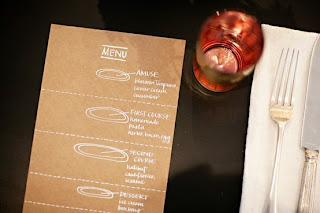 |
| Simple illustrations inform the customer of what they will be eating. |
 |
| Outside menu helps to bring customers inside. This is the first thing they see about the restaurant to it needs to represent you in a good light. |




No comments:
Post a Comment