
My initial idea for the menu's 'look' was to have a chalk board design with white chalk writing on it.


I want the app to look as realistic and rustic as possible so I have cut and sanded a wooden plank drilled holes for ribbon and painted it with black board paint.


 |
| Ribbons to chose from. The lower ribbon is the most neutral look very homely. |


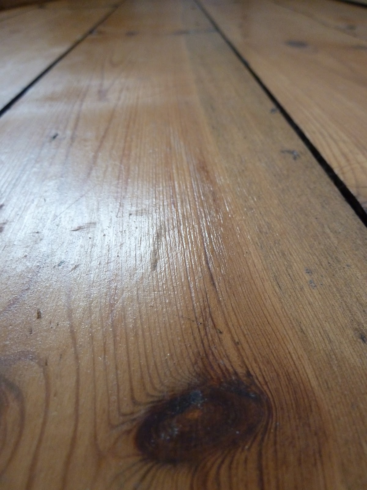
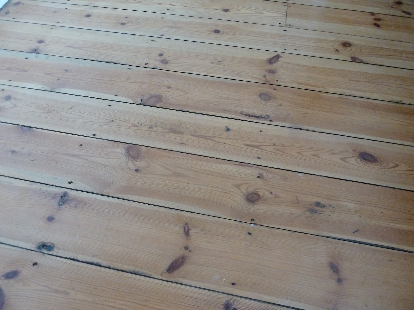
I took different photos of close up wood grain to use as a background for the app.


Flowers and intricate detail could be used for finishing touches.


Initially my idea was to make the menu board and write on it myself, however after a few attempts I decided that my handwriting wasn't up to the job and therefore decided to take photos of the menu board hung up and then to layer type over the top of the image digitally to give the desired affect.
However... my camera is not the best and I found it very hard to get the quality of photography that I need for the app. I can't get hold of a better camera today so I will rent one out at uni tomorrow. Back to another project for the moment...


 |
| This is the kind of typeface that I will be using on the boards for the menu's. |
No comments:
Post a Comment