My initial idea is to keep the app looking very homely and reflect the existing interior of the stores in Leeds. Blackboards, dark wood, string, craft decoration.
Here are a few images that got my imagination working.
 |
| Traditional black board with structured chalk typeface |
 |
| Chalk used to draw objects, could be used to draw products. |
 |
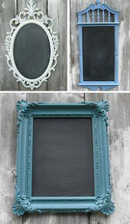
| Feminine and traditional frames for chalkboards. |
 |
| Wood relates back to nature, but adds a modern twist with the laser printing. |
 |
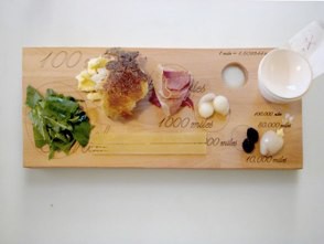
| The idea of a wooden chopping board is very rustic. It could work making it look like it was a place setting with crumbs on it and little sprigs of herbs. |
 |
| Chalk board with intricate design catches the eye because it is unusual to see something so structured on a black board. |
 |
| This is a good example how structured logos can work along side hand drawn black boards. This look is very personalised and expresses the feeling of quality. |
 |
| For the chalk writing it could be drawn using a white pen instead of a piece of chalk to make the text more easy to read. |
 |
| Wooden frames and ribbon add a homely feel. |
 |
| Structured typefaces works really well. |
 |
| Another example of rustic and modern working well together. |
 |
| Writing can be put anywhere |
 |
| Wood background gives a homely and relaxing feel. |
 |
| Structured writing. |
 |
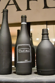
| Thinking out of the box of what could be a blackboard. You can write on anything. |
 |
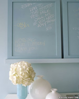
| Black doesn't have to be used for a chalk board. Different coloured boards and different chalk compliment each other. |
 |
| homely touches fit in well with the Pickles and potter style. |
 |
| Flowing 'handwitten' typefaces could work well for the specials board to emphasis that they only there for the day or the week. |
 |
| Images of fresh food or what the menu is describing give the audience a context and emotional involvement. |
Wood and chalk baord are going to be my main focus, with a touch of rustic food and craft embellishment.


No comments:
Post a Comment