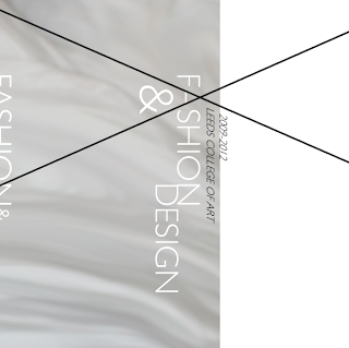
The design needs to follow the concept of minimal and cutting edge. The idea of broken or smashed glass need to be evident as well.
Initially idea of material and embellishment seemed good for a front cover idea.
Broken or muddled text symbolises 'cuts' and angles.
Incorporation of lines into the type. I think this works well because it looks like broken glass and a web of stitches. We don't want the design to be too stereotypically fashion though.
Our yearbook group were finding it hard to decide on a design that all of us liked. The brief is very broad and we were able to do anything we wanted on the cover which I think made it very hard for us to come to a decision because there was so much that we could do!
Eventually we made some sort of a break through. We decided on the colour below to feature outside and throughout the yearbook for continuity.


No comments:
Post a Comment